Learning from Boston
One and a half cheers for modern architecture
There is a great deal of modern architecture that I do not like. But when I read other critiques of modern architecture, it makes me want to defend the style(s). In this post, I’ll use the example of Boston as a way of explaining the strengths and weaknesses of various styles.
A recent paper by Samuel Hughes showed that contrary to widespread belief, the decline in architectural ornament is not due to the Baumol cost disease, indeed mechanization has actually reduced the relative cost of ornament in places such as Gaudi’s Sagrada Familia cathedral.
In a recent NYT piece, Ross Douthat cited that finding and then offered an alternative explanation to his daughter:
So I told her that from my perspective, the decline of beauty, grace and ornament in public architecture reflects a collapse of humanist confidence and religious faith, an abandonment of the assumption that human artifice is tapping into some deeper cosmic order, a fatal surrender to bad ideas about aesthetics and human life itself.
That may be true, but it’s odd that Douthat focuses his entire essay on architecture. Isn’t it equally true that there has been a decline in “beauty and grace” in painting, sculpture, music, literature, clothing, car styles, and many other aspects of modern life? To an old fogey like me, even tattoos seem kind of ugly. Why pick on architecture?
Of course Douthat is not primarily known as an art critic; rather he is one of our most perceptive observers of culture and politics:
And here is why I’m recommending Hughes’s essay now, as we leave the last of summer behind and enter into an autumn in which political considerations will overwhelm every other preoccupation. Politics matters greatly, and it matters even for the style of public architecture — which is why I am on record praising the first Trump administration’s attempt to push American architecture away from ugliness and back toward beauty. But the biggest changes in our common life often take shape independently of any vote or legislation. An idea can accomplish a great deal in the world, for good or ill, without ever winning any kind of formal political victory over its opponents. No electorate voted to replace Gothic Revival and Art Nouveau with soulless modernism, no great Western referendum did away with ornament — but a radical transformation of our physical environment happened all the same.
I worry Douthat is a bit too eager to play the populist card here. There seems to be an implication that the public favors beauty and grace, and their will is being thwarted by intellectuals intent on creating a style reflecting their own bleak view of the universe.
But is it true that the public prefers beauty and grace to modernism? Why are rock and rap music vastly more popular than Viennese waltzes? What political changes caused fully-grown men to stop wearing suits and ties to social events, and instead show up in shorts, a t-shirt and sneakers? I’m not willing to exonerate the public.
Nor am I willing to condemn modernism. Criticize modernism? Yes, by all means. But I suspect the public is much more sympathetic to modernism than Douthat assumes.
Part 1: Boston then and now
Boston has recently developed an entirely new urban district in an old industrial zone along the harbor, just south of downtown. The following video does a nice job of showing the area. Keep in mind that the video also briefly shows Boston’s far less successful downtown area. You can tell the difference from the fact that the older downtown has a bunch of 20th century buildings rising 20 to 50 floors, while the Seaport District is mostly very new buildings, generally 10 to 20 floors. (The skyline views that occur 25 and 40 seconds in show the taller downtown buildings, not the Seaport District.)
You might worry that the video is just an exercise in boosterism, and makes the Seaport District look better than it is. I don’t think so. It was already pretty impressive when I moved away from Boston in 2017, and it’s clearly developed much further over the past seven years.
Most of the buildings are glass boxes, done in the mid-20th century “International Style” variant of modernism. So is it true that the public hates this style? According to Bloomberg, the Seaport District has become the place where Bostonians wish to work, play and live. It has passed the market test:
The divides of old versus new are apparent in Boston, where the Seaport — a glittering waterfront district of towers that have largely been built over the past 15 years — is in high demand. At the end of the second quarter, less than 10% of the top-quality Class A office space in the Seaport was available, according to Colliers, while more than 25% of comparable-caliber space in the financial district was available.
On a summer Friday, tourists, residents and office workers flocked in and out of the Seaport’s Warby Parker and Lululemon stores and grabbed lunch at one of the many restaurants filling new retail real estate. The neighborhood is home to Boston Consulting Group, industrial software company PTC Inc. and the Boston Convention and Exhibition Center. It also reflects Boston’s growing stature as a biotech hub: Vertex Pharmaceuticals Inc. is based there, while Eli Lilly & Co. recently opened its Lilly Seaport Innovation Center in the district.
I actually prefer the older Boston neighborhoods like Back Bay. At the same time, I can certainly understand why the public prefers shiny modern buildings full of glass to older and darker Boston masonry buildings trimmed with lots of stone ornament. There’s something about these light-filled buildings that lifts the spirit. I get the same feeling in similar new neighborhoods in Seattle and San Francisco, but Boston’s seems the best of the bunch.
So then why only 1 1/2 cheers for modernism? Why not three cheers? It turns out that Boston has three other areas worth considering, and all three support the traditionalists:
Downtown Boston’s post-modern skyscrapers
Central neighborhoods full of townhouses
Inner suburbs like Newton and Brookline
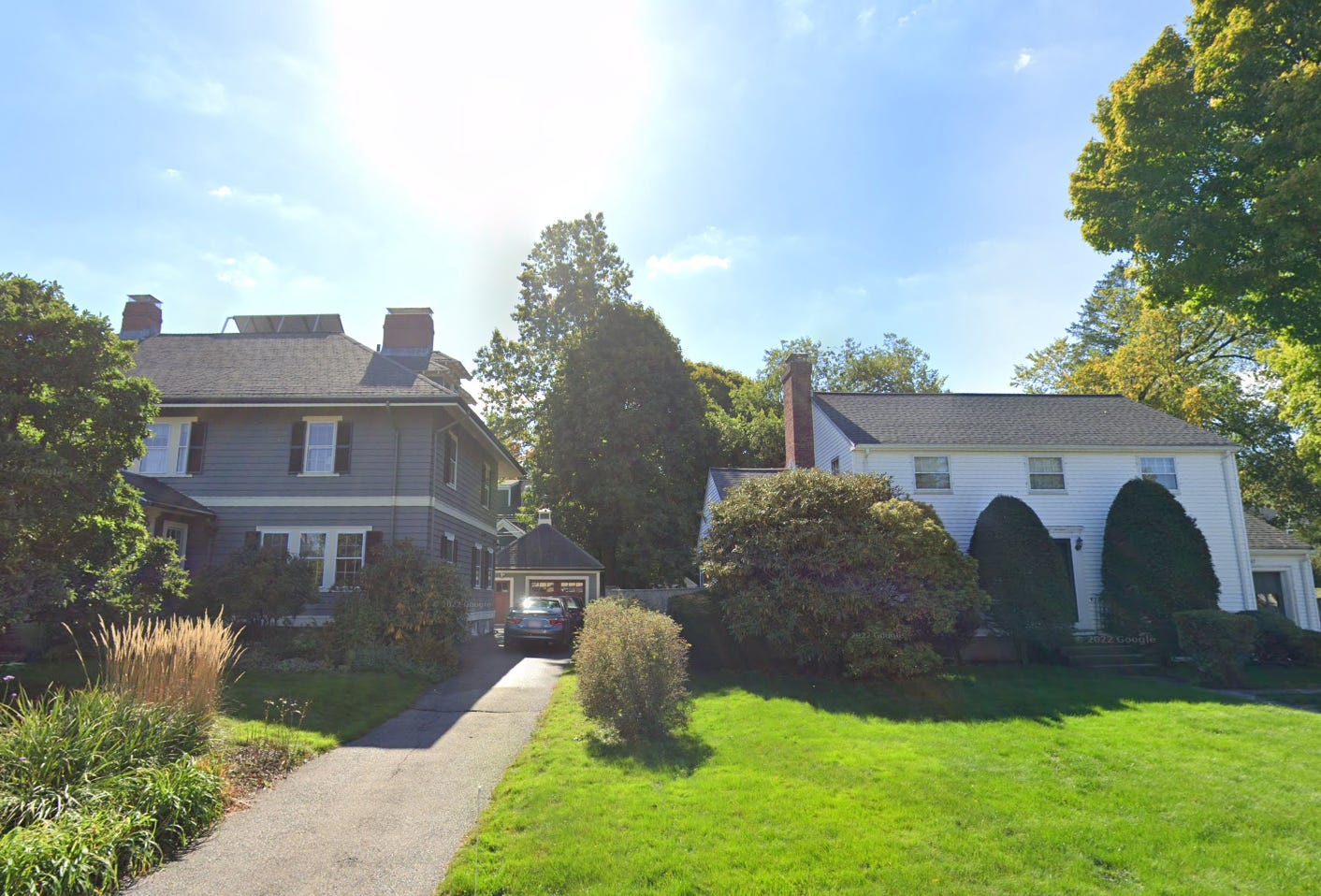
People who have been to Boston know about the attractive central areas like Back Bay, Beacon Hill and the South End, which are full of old masonry townhouses. From an architectural perspective, these areas are highly successful. The same is true of Boston’s inner suburbs (inside 128.) The best parts of the inner suburbs are the homes built between 1890 and 1930. Here’s a Google street view from a couple blocks away from where I used to live in Newton:
It’s unfortunate that the vegetation has obscured things since I moved away, as I always thought these two homes were an object lesson in the art of architecture. They are both 2-story rectangular boxes with wood siding, but one is a very handsome design and the other is pretty bland.
The one on the left was built in 1900, and the owners would have likely had a live-in maid. The other was built in 1955, when houses were put up rapidly due to an extreme scarcity created by the Depression and WWII. (If you are in the NYC area, contrast Long Island suburbs from the 1920s with the 1950s Levittowns.) Today, Newton is affluent and the newest homes being built are fairly attractive from an architectural perspective. It lucked out in having relatively few post-WWII homes.
Contrary to popular opinion, downtown high rise districts are not all the same. For instance, Chicago is known as having far more attractive skyscrapers than Boston. One of Boston’s problems was that its economy was sluggish when the best modernist buildings were erected, and only got going during the much more spotty “post-modern” period.
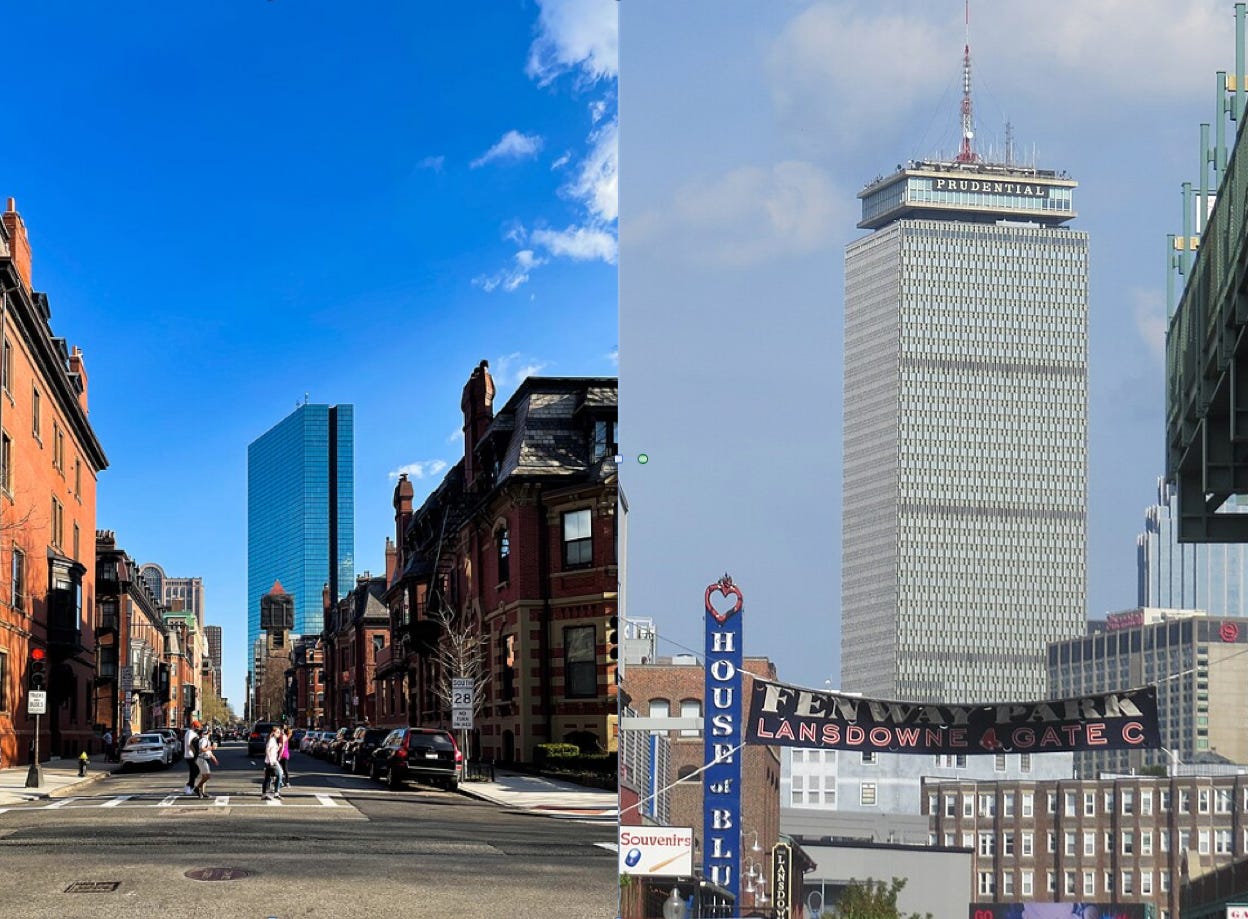
Skyscrapers are very large buildings and unfortunately it’s difficult to predict what style will work in a given setting. Putting the oversized John Hancock building (left) on historic Copley Place should have been a disaster, just as the industrial looking Eiffel Tower should have been a disaster for Paris. But somehow both work. In contrast, the nearby Prudential Center (right) is an architectural failure, albeit not as egregious as Paris’s Montparnasse Tower.
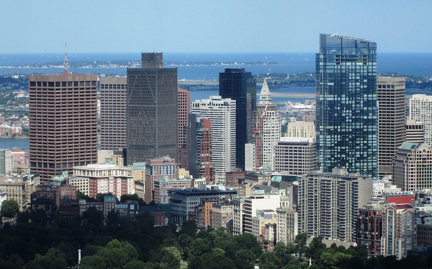
Unlike Chicago, Boston’s skyline (below) is mostly bland. The tallest and perhaps best downtown tower (on the right) was built after I left in 2017.
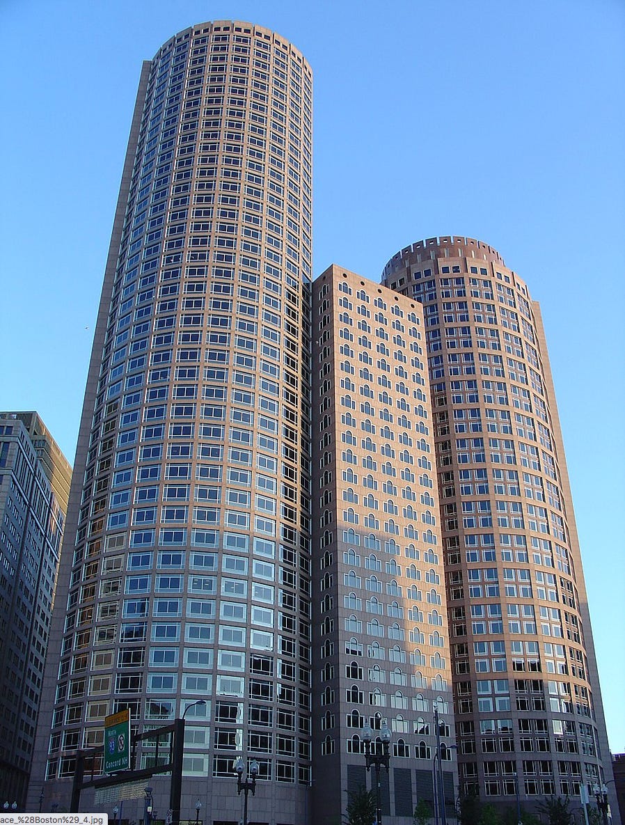
Even worse than bland is ugly. Whose idea was it to put Palladian windows on this Boston skyscraper? In my view, post-modernism was mostly an aesthetic dead end.
I don’t care if it’s “witty”. Even the best jokes wear off after a few days, and skyscrapers can last for centuries.
Part 2: Lessons from Boston
So we have lots of successful traditional Boston architecture, and a decidedly mixed picture for modern buildings. That seems to favor the traditional styles. But I’d like to offer a few cautionary notes:
First, it’s not clear that it’s easy to go back and recreate the classics. Suppose someone shows you a picture of a brand new grandiose Greco-Roman style government building built in the past decade, but they don’t tell you where it is. You have to guess. Do you guess Australia or Turkmenistan? I’m not sure why, but in the 21st century the biggest fans of classical architecture are some of the worst dictators on Earth. That’s certainly not definitive, but surely it’s telling us something.
When America was founded, classical architecture was identified with liberal values. In today’s world, it’s more often associated with authoritarian values. Here’s North Korea’s parliament:
Recall the old joke about most countries with presidents being dictatorships and most countries with monarchies being democratic.
I don’t think we can go back, but I do think that we can go forward in a way that is informed by the best of the past.
Samuel Hughes has another essay that expresses views pretty close to my own:
Since at least the nineteenth century, debate has intermittently flared up around the question of what styles of architecture we should build. In recent decades the two sides have often been characterised as ‘traditionalists’ and ‘modernists’, supporting the use of traditional and modernist architectural styles respectively.
To some people, this framing feels strange. These people have the impression that we used to make fewer ugly buildings and dysfunctional places. They don’t accept the idea that technological modernity somehow morally requires us to build in an austere ‘modernist’ style. But they also find it bizarre to be dogmatically in favour of the use of old architectural styles rather than new ones. People in this group feel that the debate has gone wrong somewhere. They are ideologically homeless: they are obviously not ‘modernists’, but they are also uneasy with the ‘traditionalist’ label. I count myself in this category, and I think quite a few other people fall into it too.
I believe that the ‘traditionalist’ framing is indeed a mistake, and that there is no reason to favour traditional styles per se. But there are important reasons why we should favour some architectural styles over others – reasons that are special to architecture, and that set it apart from music, literature, painting or film. Architecture is a public art, a vernacular art, and a background art: it is created by a huge range of people, and experienced involuntarily by an even wider one. This means that we need architectural styles that are as accessible as possible, to the full range of people who live with what we build, and to the full range of builders who create it. Some ‘traditional’ styles might well be useful in achieving this, but it is not their being traditional that matters: any style with broad and deep appeal will do just as well.
I happen to like the modernist houses being built in Laguna Beach and also the more traditional Tuscan style homes being built in nearby Irvine. Each serves a useful purpose. (I’m much less fond of the over-styled McMansions being built across much of exurban America, but to each their own.)
Hughes persuasively argues that the relevant distinction is not traditional vs. modern; it’s easy vs. difficult architecture. It doesn’t matter if post-modern novels, cubist paintings and atonal music are inaccessible to most people. Architecture is different because we are all forced to consume it.
I suspect that Hughes would agree with my claim that the modernist buildings of Boston’s Seaport District are relatively “easy”—accessible to most people. He suggests that even some brutalist buildings are fairly accessible.
Hughes also draws a second distinction between easy and difficult architecture. He notes that styles like Georgian are relatively easy for a competent architect to master, but brutalism is only effective when done by a highly skilled architect. There are a very limited number of true artistic geniuses; thus when architecture must be produced in large quantities the ease in creation for a given style is every bit as important as ease in appreciation.
Here’s Hughes:
Some of the really challenging styles can yield masterpieces in the hands of masters, but will generate a mess in the hands of minor architects and commercial builders. . . .
Turn now to possibly the most contentious style of all, brutalism. Many people can name some brutalist buildings for which they have at least qualified affection. Here are some of mine: the Barbican Centre, Harvey Court in Cambridge, Clifton Cathedral, the Alexandra and Ainsworth Estate in St John’s Wood, the old Academy of Arts in Berlin, Our Lady Help of Christians in Birmingham. But the kind of genius that created these buildings is not widespread, and it is much less clear that the style is safe in the hands of talentless architects or commercial builders.
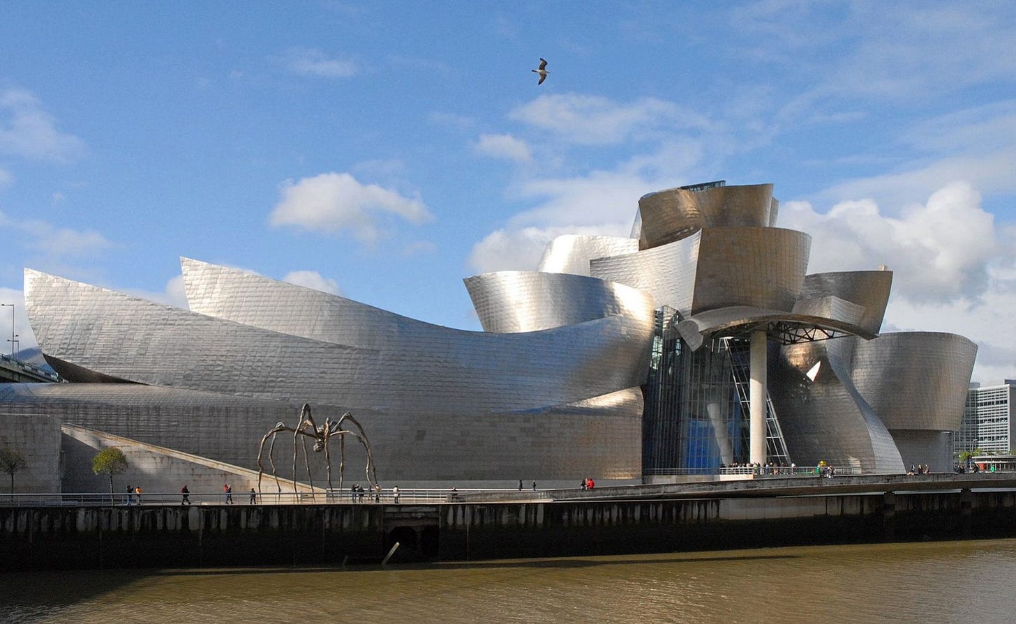
I’d say the same of post-modernism. Imagine asking a cut-rate architect to “Build me a Frank Gehry style building”:
Consider an analogy from painting. Compare portraits by Renoir and Van Gogh:
I suspect that most people in the world prefer the Renoir, viewing it as prettier. But a significant number of people prefer the Van Gogh, including a majority of art experts. Nonetheless, we’d say that the Renoir has a greater ease of appreciation.
More importantly, a competent artist would probably find it easier to work in the impressionist style used by Renoir as compared to the intensely expressive style used by Van Gogh. Any halfway competent impressionist painting is pleasant to look at. In contrast, an attempt to imitate a highly expressive genius like Van Gogh or blue period Picasso is likely to result in kitsch.
Let me end with a few general observations:
Modernism is a mixed bag. Lots of bad examples but also lots of great stuff.
When buildings are produced in large quantities, we need styles that are easy for mediocre architects to master.
Size matters. Skyscrapers need to be simple—people won’t be able to see much ornament when it is 50 floors up.
Today, people like big windows—that tilts us toward modernism.
Most new homes will reflect the taste of buyers. The richer the society, the worse the average taste of decision-makers. That’s why suburbs built in the 1920s are significantly more attractive than suburbs built in the 1970s, when even the average person could afford new homes. When it comes to single-family homes, modernism is the least of our problems.
Older areas often look best because the surviving homes have stood the test of time. In 30 years, central Houston will look much nicer than it does today, whereas central Boston will be largely unchanged. In Houston, rundown ranch houses are being replaced by up to three handsome townhouses on a single lot. Houston will begin to look more like Boston.
Major government buildings that are built to last should use an easy style, which is less likely to look dated in 100 years. They can be traditional or modern.
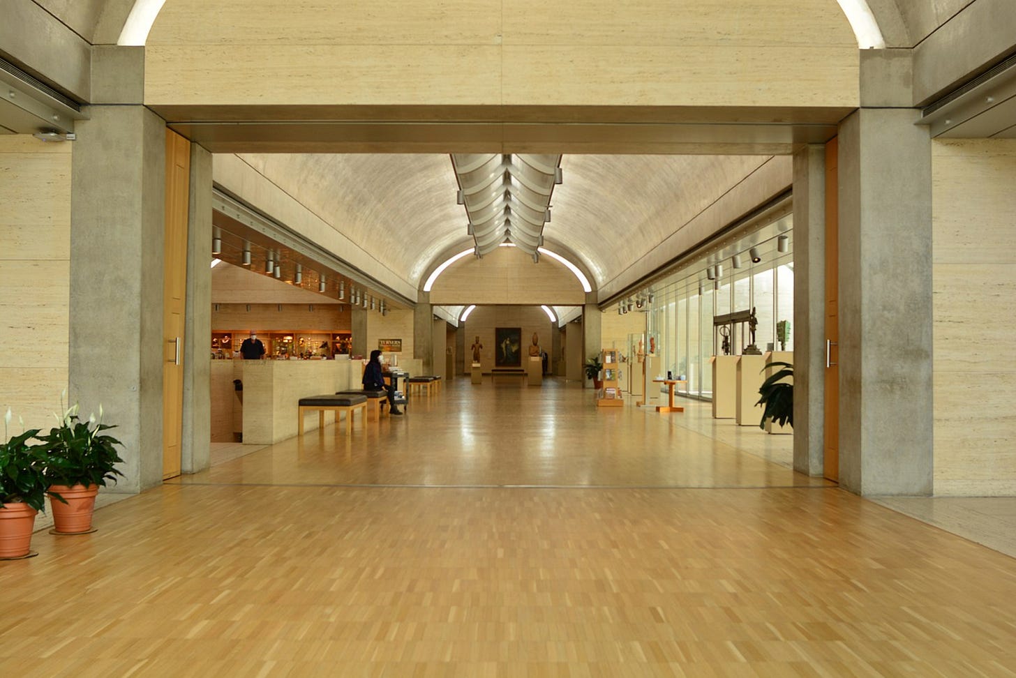
One final point. It’s not clear where some of America’s greatest architects fall in the traditional/modern spectrum. Who gets to claim the Kimball Art Museum (below), Fallingwater, or Owatonna Bank? I’ll do a future post on Sullivan, Wright and Kahn. This one has already run too long.
PS. If you are confused by the difference between modern and post-modern architecture, the latter tends to be more complicated, more playful, and more asymmetric. A bit crazier. Post-modernism of the 1980s is to the more classical modernism of the 1960s roughly what mannerist painting is to Renaissance painting.
Modernism: Less is more.
Post-modernism: Less is a bore.





A lot of good ideas here.
I'd point out that one reason the brutalist Boston City Hall is the most hated building in America is because of the lack of any greenery around it. Brutalism looks okay in Brazil surmounted by jungle, but in Boston it's only available for half the year. Still, the architects didn't try to plant any plants around the City Hall.
The Seaport heights are capped at 20 stories due to FAA regs for airport flight paths. Incidentally, this is why the downtown towers are shorter than the ones in Back Bay, too. Given full freedom, the Seaport would definitely have more and varied heights.